![]()
![]()
![]()
Next: E(m) graph Up: Performance modelling Previous: T(V) graph
S(m) graph
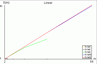
This graph shows relationship between the speedup* and number of processors m. The shape of displayed curves depends on selected architecture and C/A and S/A values. The S(m) graph is displayed in linear scale only.
Number of processors m (horizontal axis) is different for different architectures. For chain, star and hypercube each next value is twice greater than the former. For mesh architecture the number of processors in for the next curve is five times greater than for the previous one (as explained in the section about meshes for 2-dimensional mesh p=4, and every new layer the number of working processors increases five times).
Minimum and maximum number of processors are shown at m axis.
No more than five curves with a legend (bottom of graph) are displayed. These curves indicate different problem sizes V.
Not every curve ends at the maximum number of processors value. For the given problem size V and system parameters the solution can be found only for certain number of processors m. Therefore, an infeasible points are not shown in the graph.
Due to the way S(m) graph is drawn (entire length of the vertical axis is used to show the range of S(m)), and due to the rounding errors, some unexpected curves may appear. For example, one can obtain a curve increasing from S(1) = 1 to S(m') = 1, where m' is the maximum number of processors for the chosen architecture. In fact S(m') > S(1) but S(m') is only slightly bigger than 1. The value of S(m') is rounded to 1 and displayed at the vertical axis of the graph.
*
Speedup:
S(m) = T(1)/ T(m),
where T(m) is schedule length on m processors.
Informally, speedup can be understod as an indication of
the parallel application acceleration achieved by adding processors.