![]()
![]()
![]()
Next: Animations Up: Performance modelling Previous: S(m) graph
E(m) graph
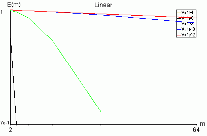
This graph shows the relationship between the efficiency*) E of a parallel application and the number of processors m. The shape of displayed curves depends on selected architecture and C/A, S/A values. The E(m) graph is displayed in linear scale only.
The number of processors m (horizontal axis) is different for different architectures. For chain, star and hypercube each next value is twice greater than former. For mesh architecture the number of processors in for the next curve is five times greater than for the previous one (as explained in the section about meshes for 2-dimensional mesh p=4, and every new layer the number of working processors increases five times).
Minimum and maximum number of processors are shown at m axis.
No more than five curves with a legend (top of graph) are displayed. These curves indicate different problem sizes V.
Not every curve ends at maximum number of processors value. It's
because there may be no feasible solution for given parameters.
A solution is infeasible when one of ![]() <=0 which indicates that processor Pi need not be
activated.
<=0 which indicates that processor Pi need not be
activated.
Note that due to the way E(m) graph is drawn (using entire length of vertical axis to show the entire range of E(m)), and because of rounding errors, some unexpected curves may appear. For example, one can obtain a curve decreasing from E(1) = 1 to E(m') = 1, where m' is the maximum number of processors for the chosen architecture. In fact E(m') < E(1) but E(m') is only slightly less than 1. This value is rounded to 1 and in this way shown at the vertical axis of the graph.
*)
Efficiency:
E(m) = S(m)/m
where S(m) is
speedup on m processors.
Informally, efficiency indicates what fraction of the processor pool
is really working.